
Introduction:
Hey friends, this is Janine from yeunglove! I am a Chinese-Canadian creative currently based in Toronto. I am originally from Vancouver BC, but relocated to Toronto to pursue an interior design career, which started by attending university here in the city. I have been designing for as long as I can remember, but it wasn’t always stationary or the cute characters you see now. I’ve always found a way to express myself through visual arts in one form or another. I used many opportunities in school to turn nearly every submission into a mini art project or graphic branding exercise. I just couldn’t help it! I was always the most excited by assignments and projects that could lend itself as a canvas to something greater. I was more excited by how the assignment could look as a work of art or cool graphic—sometimes more than the actual subject matter (oops—good thing I’m not a scientist)!
Artistic Journey and yeunglove:
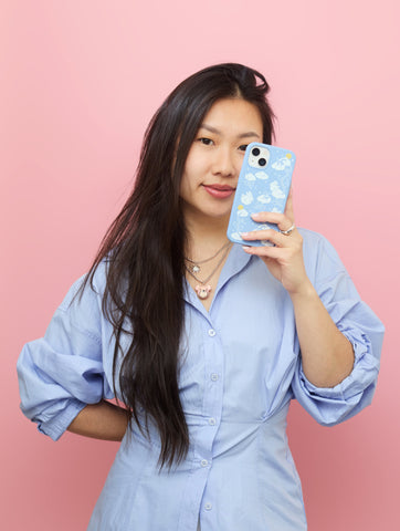
Yeunglove grew out of my love for making people feel seen, and combining that with my love for creating. It sounds silly but it's the truth! I’ve always loved making little characters and graphics on Adobe Illustrator. Some time in my early twenties, I decided to make birthday cards for my friends and coworkers. In these cards I drew a cute character in their liking, with details relating to their physical appearance, clothing, and surrounded them with little icons in a scene that told a little story about who they were. They were a hit! I got some nudges here and there to start a little biz, but I was doubtful and afraid. Fast forward a couple years from then and I decided that I should pursue my dreams. And here we are today! Still chasing that dream 🙂 I dream of a creative, fulfilling life of colour and cuteness. I am so blessed that I get to design and be creative for a living in my professional career and by pursuing yeunglove. Favorite Design and Inspiration: My fave case from this collection has to be ‘Pretty Picnic’ on the bubblegum pink case. It’s just so fun, girly sweet! As a designer I am guilty of dressing in black way too often—so I’d like to think that this case is an expression of my inner sweet-baby-angel girly. I love the colour palette I used for this case, which ventures more into the pastels. I think the colours really complement the case colour. The arrangement of the picnic-inspired icons on the case is also a bit more fun and unexpected. I wanted to make sure there was a good balance between the artwork and negative space to reveal the beautiful material of the Pela case. The ‘Fluffy Flower’ in the powder blue case is a close second! Blue is my favourite colour and I just am so in love with how the white prints against the blue. Luckily I have all of them 🥰

Message Behind the Artwork:
When I’ve done markets and stationary shows, my favourite part of the day is seeing the faces of the people who come and see my work. It's almost always ‘omg—so cute!’—and at the end of the day, cute is what I’m aiming for. I always love to see what items my customers will choose too, it's always so surprising! I know that feeling when you’re out and about and see something that catches your eye and you internally gasp (sometimes audibly) and your heart beats a little faster. Yes, that’s what cute things can do to me 😂 That’s a large part of the feeling that I’d like to inspire in someone else. Because I am also my own customer and I love that feeling so much! I like that there is often a playful (sometimes sassy) demeanor to my work because my goal is to have fun while creating it. It's really about having fun and creating a safe, cute space.

Creative Process and Sustainability:
I draw a lot of inspiration from my childhood watching cartoons and anime (think Doraemon, Hello Kitty, Sailor Moon, Chibi Maruko-chan, the list goes on). As a child, my favourite store was called Morning Glory, a Korean gift shop. My Dad would take me there often and he would let me pick one item to take home, and I would obsess over it until the next time we went again. Sometimes it was a notepad, a sheet of stickers, a little plushie or a keychain. These were such special moments for me, and I would do the same for my own child one day.
My creative process varies and differs from project to project. For this collaboration with Pela, I first picked my case colours from the core collection and used that as my starting point. I drew inspiration from the case colours to derive a palette and paired it with a Spring-inspired narrative. Then I got to illustrating! These concepts were eventually realized as groupings of cute icons that could work together.
Art is a great medium. It inspires connection, provokes thought, conversation and of course— provides some nice visual stimulation. These are all great attributes, and can be beneficial to getting a message across when paired with other concepts. In my opinion, attaching art to sustainability can make it a more approachable practice. And if you’re going to purchase a phone case, why not get a cute one you can compost?!


